Responsiveness is one of the most crucial factors that help you improve the user experience and avoid common SEO mistakes that can negatively impact your ranking. Google has implied its importance several times, still, many marketers and designers fall short of creating a structurally and visually responsive website. If you are struggling with the same issue, this blog post provides you with detailed steps that will help you improve your website’s responsiveness. Let’s start!
What is responsive web design?
It’s an approach to web design that ensures websites render well on a wide range of devices and screen sizes, from small smartphones to large desktops. Responsive website design (RWD) is designed to adjust its appearance and interactive elements according to the device it’s accessed on. It employs CSS to offer adjustable style attributes like font, menu, and images. These style attributes can change based on the device’s screen size, orientation, colours, and other features.
Which web browsers are popular today?
Responsive designing is all about creating a smooth user experience across various devices. Now that there are multiple web browsers, each has a different way of rendering the web pages. That’s why you should test your website on a variety of devices and browsers as well.
Although a developer is considered to be responsible for ensuring a website is responsive, in real terms, it’s design that determines how different UI elements will appear on different screen sizes for an optimal UX.
Here is the web browser market share worldwide for desktop and mobile:
- Internet Explorer: 3.35%
- Opera: 4.03%
- Firefox: 5.72%
- Safari: 14.86%
- Chrome: 55.04%
What are some common screen resolutions for responsive design?
Here are some common screen resolutions across tablet, desktop, and mobile users throughout the world.
- 360×640 (small mobile): 22.64%
- 720×1280 (large mobile): 2.74%
- 375×667 (average mobile): 5%
- 1440×900 (average desktop): 3.17%
- 1366×768 (average laptop): 11.98%
- 1920×1080 (large desktop): 7.35%
The data above shows a wide range of resolutions, indicating that no specific device is currently dominating the market share. This means designers cannot consider just a few resolutions when thinking about responsive web design.
Examples to get inspired from
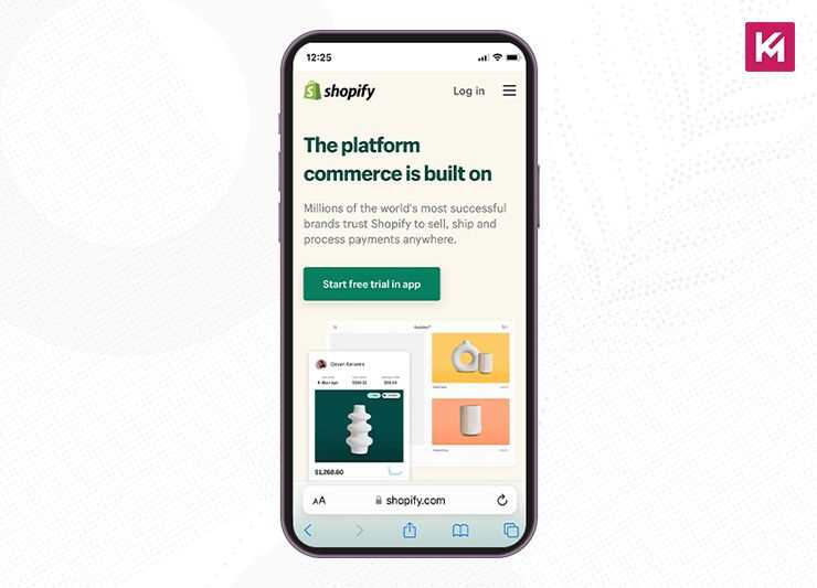
Shopify
Shopify is a global e-commerce platform that helps its users easily set up their online store. It has a consistent user experience across all devices as it adapts its CTAs and illustrations for users browsing from any device. You can see on desktops and tablets that its main CTA button comes at the right of the form field, whereas on smaller devices, it shows up underneath. This is how it creates an intuitive experience for its users.
In image below, you can see the email sign-up collapsing into a small icon. These expandable small icons are very useful in saving space and creating a neat appearance.
Airbnb
Airbnb is a platform that connects people who want to rent out their homes with people looking for accommodations. On its website, users can easily find a destination and data search form, which further guides them through logical steps in their customer journey. Its navigation bar segments the listings into various categories, making the bar catchy and super easy to use.
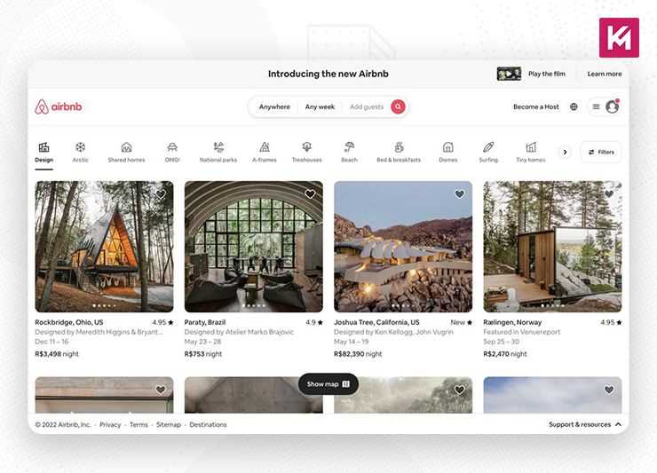
There is also an option of smart search which auto-fills the user’s last search. Just think like a user; isn’t it convenient to minimize the friction? Websites with large product offerings should learn from this example and focus on giving their users a fast and reliable way to search. Adding an easily findable search bar function and filter options boosts the responsiveness of your website.
Airbnb also features beautiful, high-quality graphics of rentals that trigger urgency in users and prompt them to book. This is also something to get inspired from while designing your website, using media elements to boost your conversions.
What are the best practices for creating a responsive website design?
Using the following practices, you can optimize your website’s responsive design:
Mobile friendly approach
The mobile-first approach is based on prioritizing websites for mobile devices first and adapting for larger screens later. This approach is widely adopted nowadays as a significant portion of web traffic comes from smartphones and tablets. By designing for a smaller screen, you will naturally focus on the most crucial content and functionalities, ultimately creating a streamlined and focused user experience.
A design built for a smaller screen can be easily scaled and added with features for larger screens rather than vice versa. Whereas the traditional approach to designing was mainly focused on desktops and then adapting it for mobile devices, this convention has been changed as it leads to a clunky mobile experience. The traditional way of designing leads to many issues, such as hidden content, higher development costs, and, most importantly, less favoured by Google.
What’s Google’s Stance on Mobile First Design?
In 2016, Google announced a significant shift towards mobile-first indexing. This means when they evaluate and rank websites for search results, they primarily use the mobile version of your website. This move depicts the constantly growing dominance of mobile web traffic.
If we take a look at the timeline of Google’s mobile-first journey, it’s evident that much of the focus remains on the mobile-first design:
- In 2015, Google’s search algorithm started favouring “mobile-friendly” websites in search results.
- In 2016 Google started the process of mobile-first indexing, crawling and indexing websites primarily through the mobile version.
- In 2020, Google announced a deadline to complete the switch to mobile-first indexing for all websites, which was later extended.
- 2023 officially witnessed Google declaring the transition to mobile-first indexing officially complete.
So, what’s its Impact on Your Website?
With mobile-first indexing, having a well-designed and optimized mobile website becomes crucial for good search engine visibility. Here’s why:
Mobile Experience as Ranking Factor
Google prioritizes websites that offer a positive user experience, and a responsive and mobile-friendly design is a major factor. Google core web vitals, which measure aspects of user experience on a web page, consider mobile experience to play a vital role in ranking algorithms.
Mobile Crawling Efficiency
Google’s search engine bots can understand the content of your website more efficiently and crawl if the mobile version is well-structured and optimized.
Faster Mobile Load Speeds
Mobile-optimized websites usually load faster, which is another ranking factor for Google.
How to create a mobile-first design?
- Start with a Wireframe: Sketch out the layout and structure of your content. Focus on what information is important and how you can arrange it for optimal view on a small screen. Tools like pen paper or whiteboards can be used here.
- Prioritize Content: Now, categorize content based on its importance. Space on a mobile screen is limited, so some content might need to be hidden or rearranged for better readability.
- Mobile friendly navigation: Make sure to design a navigation system that is intuitive and easy to use on a mobile touch screen. For example, hamburger menus or collapsible menus are great for saving space. Please note that icons and clear labels are very important for easy navigation, so don’t forget to use them while designing the navigation.
- Focus on user flow: Plan out the entire user journey on the mobile screen. How will users find the information they need and complete desired actions, such as making a purchase or filling a form with as few steps and taps as possible?
- High-Fidelity Mockups: Once you have a solid foundation, create more detailed mockups that resemble the final design aesthetic. This helps visualize the layout, branding, and overall user experience on a mobile screen.
- Responsive design implementation: Use CSS frameworks to simplify the process of creating a design that adapts to different sizes. You can use frameworks like Bootstrap or Foundation, as they have pre-built responsive layouts and components.
- Media queries: Use media queries to define specific styles for various screen sizes. This ensures the layout, font sizes, and other design elements are adjusted for optimal viewing on desktops, tablets, and various mobile device sizes.
- Test and Refine: Run continuous tests to check the design on different mobile devices and screen orientations (portrait and landscape).
Tips for creating mobile-first design
- Avoid cluttering the mobile screen; focus only on the essential information.
- Make sure all interactive elements, such as buttons, have enough space for tapping, especially considering fingers rather than mouse cursors.
- Use relative units like em or rem for text so that it can scale well on different screens.
- Make sure your images are compressed and sized properly for the fast loading times on mobile data connections.
- Minimize the code, leverage the caching mechanisms, and optimize images for faster loading speeds.
Scalable Navigation
Scalable navigation refers to menus that can adapt and adjust their layout and functionality based on the screen size of the viewing device. While traditional navigation menus are designed for desktops, they can become clunky on smaller screens. Scalable navigation can ensure a smooth and intuitive user experience across desktops, tablets, and smartphones.
With scalable navigation, users can easily find the information they need on any device, making your website Google-friendly.
To make your navigation scalable, you have to employ the following techniques:
- Identify the most crucial navigation links and prioritize their placement on mobile screens.
- Use short, clear, and descriptive labels for navigation links for easy understanding.
- Use the hamburger menu. It is a three-line hamburger icon that collapses the menu options when not in use and saves space for the smaller screens.
- Organize the menu with accordions, which are expandable sections that further reveal subcategories upon clicking.
- Incorporate icons alongside text labels for faster visual recognition, especially on mobiles.
- Use mega menus, as they can change into a scrollable list for better usability.
- Take advantage of CSS frameworks like Bootstrap or Foundation that offer pre-built responsive navigation components.
- Test your navigation menus across various devices and screen sizes to ensure optimal functionality.
When you have this well-organized navigation, search engine bots can more efficiently crawl and understand the website structure. Moreover, this can also help in reducing the overall page size on mobile, potentially leading to faster loading speeds, which is another ranking factor.
Use Negative Space Smartly
The white space on a website that is left vacant on the website is negative space. For all the elements to look fine and functional, negative space is mandatory.
You cannot put excessive graphics and large text on a page. This can make your website look cluttered and overwhelm the users, hindering them from finding simple information.
The right way to create a responsive design is to approach the content and navigation with minimalism. Use negative space to improve your website’s visuals and increase the readability of text and user experience for a visitor.
Negative space acts like breathing room for your design elements. It prevents things from feeling crowded and overwhelming. By using negative space around important content, you make it stand out more. Negative space helps guide the viewer’s eye around your design, creating a clear path for them to follow.
Boost your website’s ranking with responsive images
Make sure your images keep loading quickly, no matter which device is used. For this you will need to optimize your images to increase your web pages’ speed.
You know how important it is for a website to load quickly to do well on the search engine, create a better user experience and keep the bounce rate low. When your site loads slowly, your user might leave to find the information somewhere else.
Responsive design can look great on small screens, but large images can make websites load painfully slow. Responsive images offer a smart solution to this problem.
Responsive design ensures a website adapts its layout to different screen sizes. However, a common issue that arises with images is that websites often use high-resolution images optimized for desktops. These large files (often several megabytes) remain the same size even on smaller mobile screens. Large image files take longer to download, especially on slower internet connections. This significantly impacts website loading times, frustrating users on mobiles.
Responsive images address this issue by delivering the right image size for the device viewing the website. There are two main approaches, first by creating multiple versions of the same image in different sizes (e.g., small for mobiles, medium for tablets, large for desktops). The browser then chooses the most appropriate image size based on the user’s device. The second is to use HTML features to specify different image versions and their ideal display sizes. The browser can then automatically select and download the optimal image for the user’s device.
Wrapping Up
The ways people shop online have changed, and competition is rising. Each business strives to make its website as user-friendly as possible. With rapid advancements in the market, it’s imperative to implement the features mentioned above in your online store. If you are missing any of these features, we hope you will seriously consider optimizing your site.